The Non-Designer's Design Book
NUS library reminded me that this book is due today. This urged me to read the second half of if.
The first thing I learned from the book is: Once you can name something, you’re conscious of it. You have power over it. You own it. You’re in control.
Now, let’s name 4 basic principles below.
the Essence of Design:
- Our purpose is to attract people and make them read.
- Keep things simple if not necessay,
- Alignment : each element has visual connection to the others
- Repetition: keep unity
- but we all need Contrast to emphasize
- and group related items as a visual unit – Proximity.
Notice your Eye Flow
A bad design of business card and a good one:
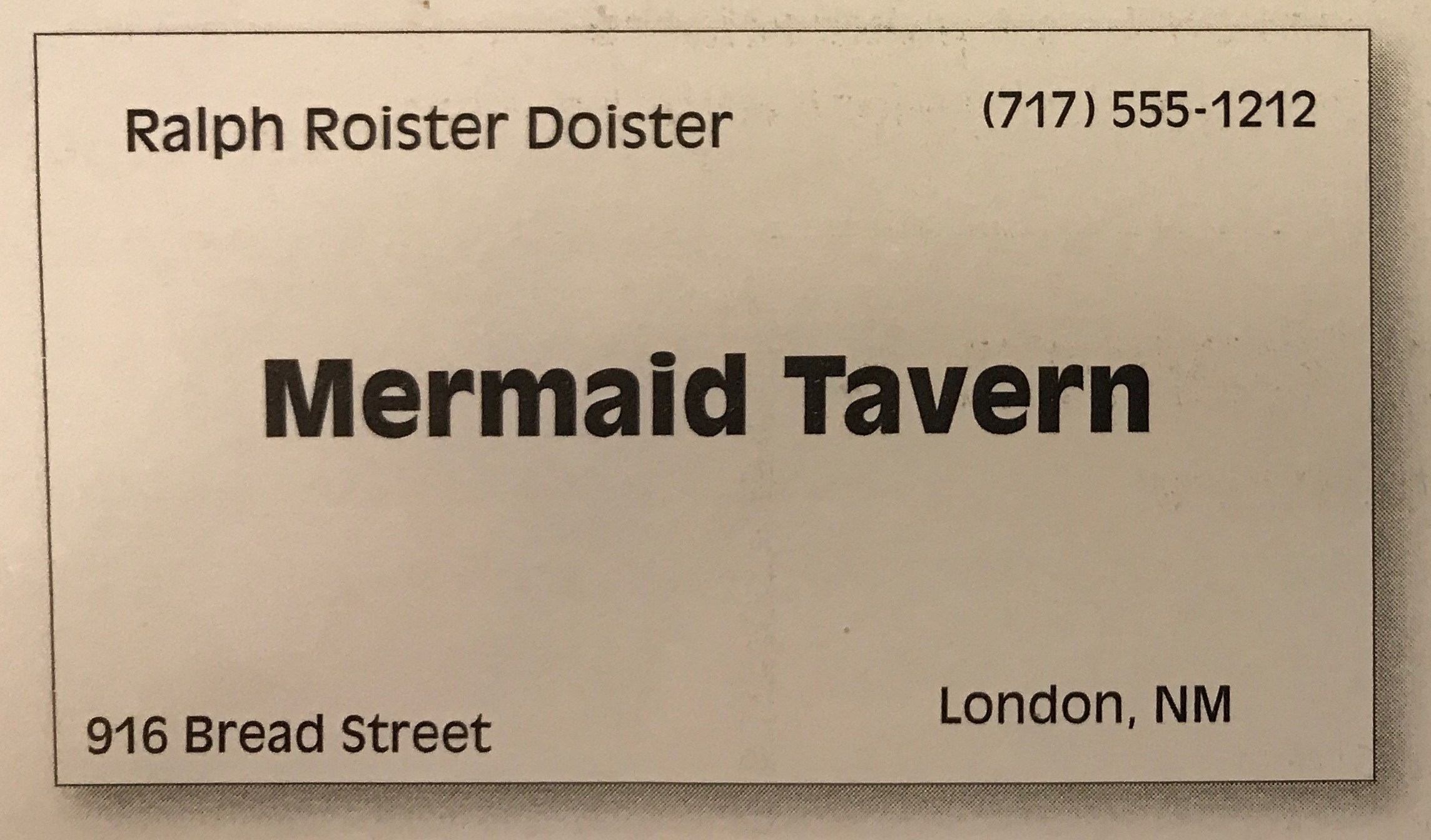
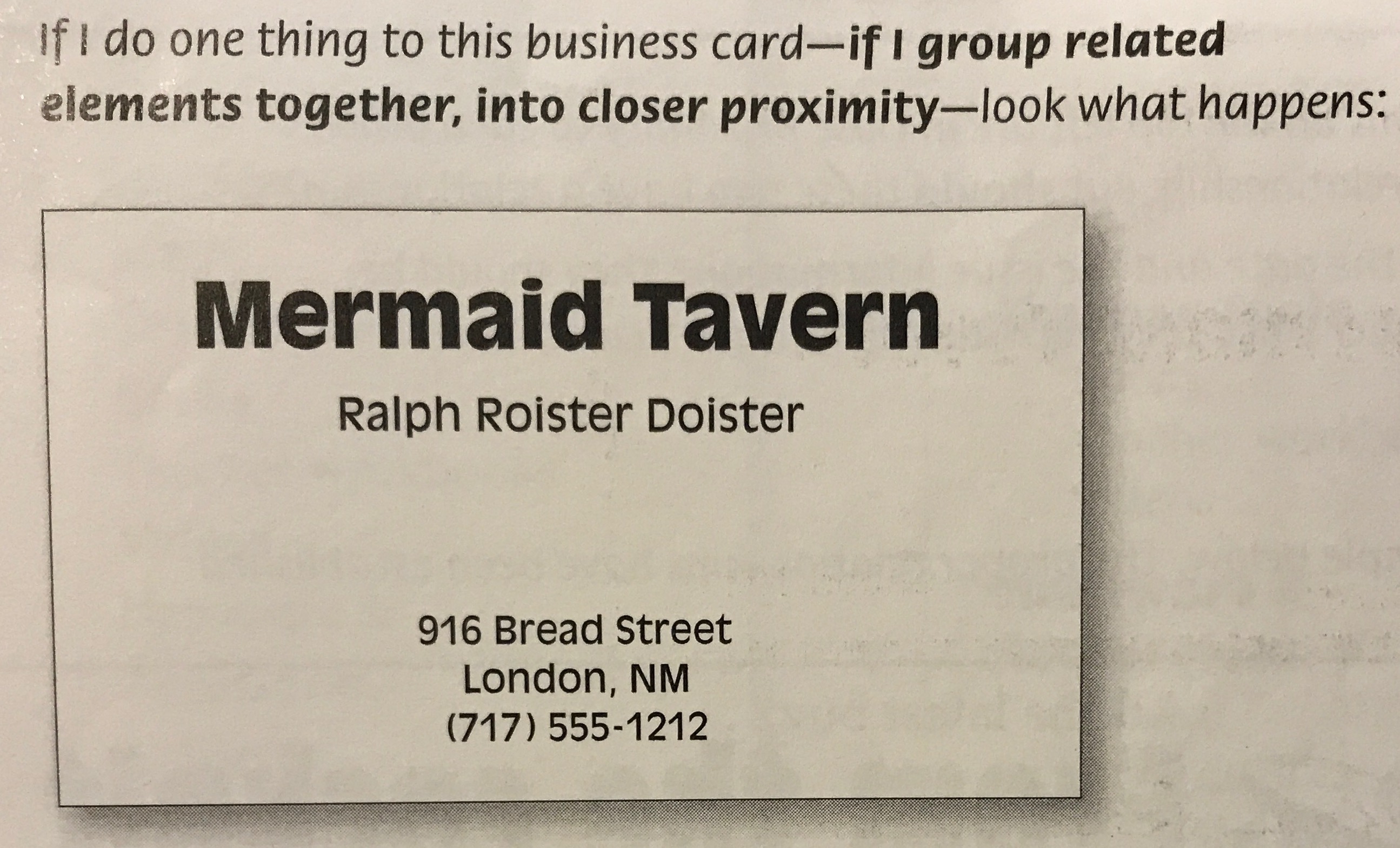 Attention is attracted to Bold things first, then the middle, then from up to down, left to right.
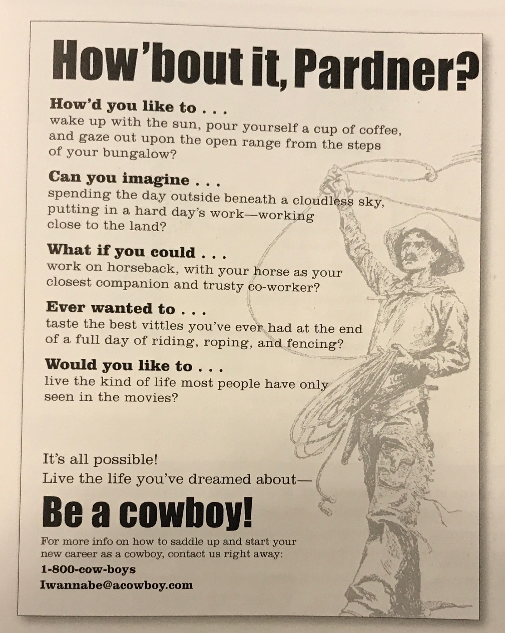
let Picture do its work
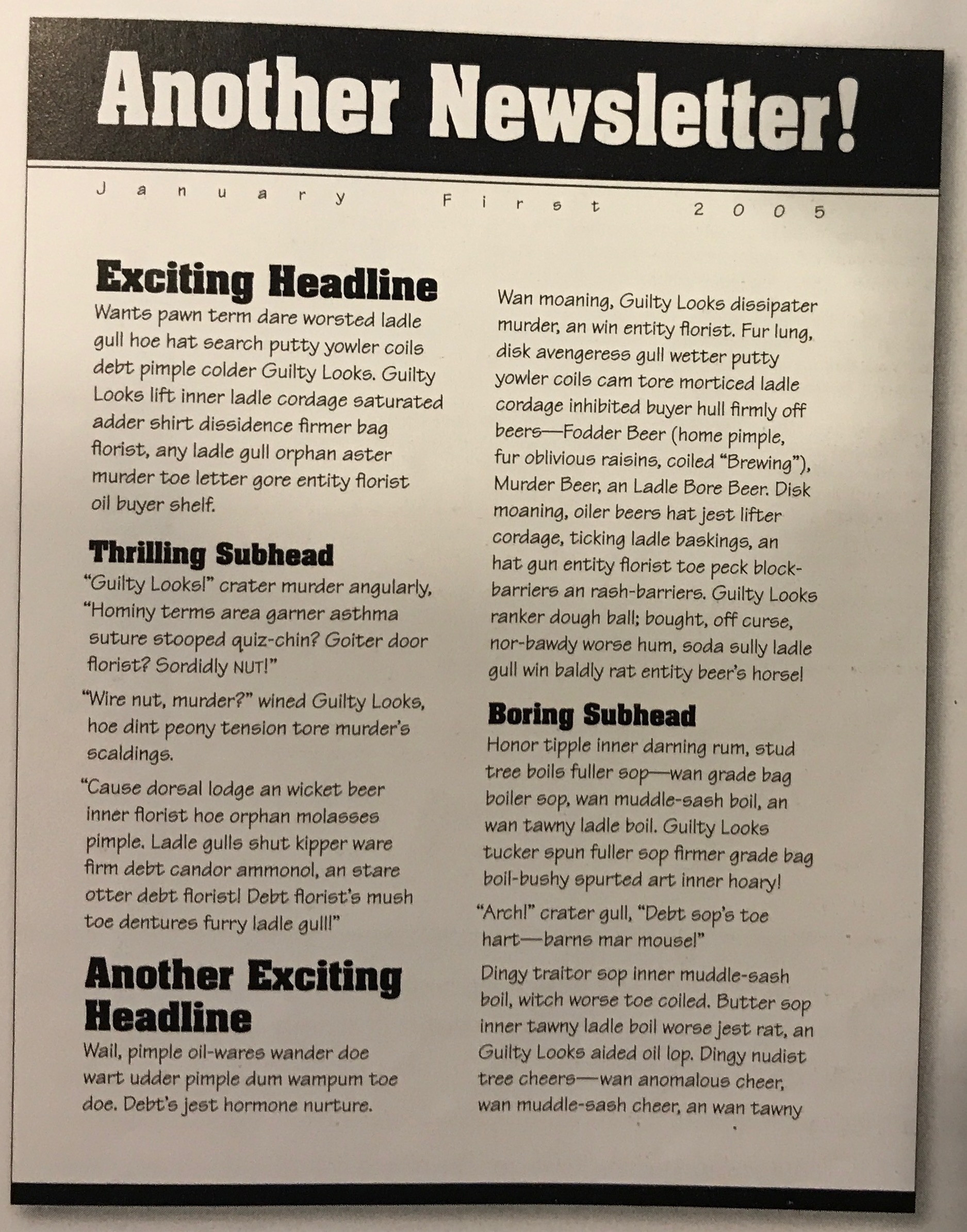
An example of Newsletter
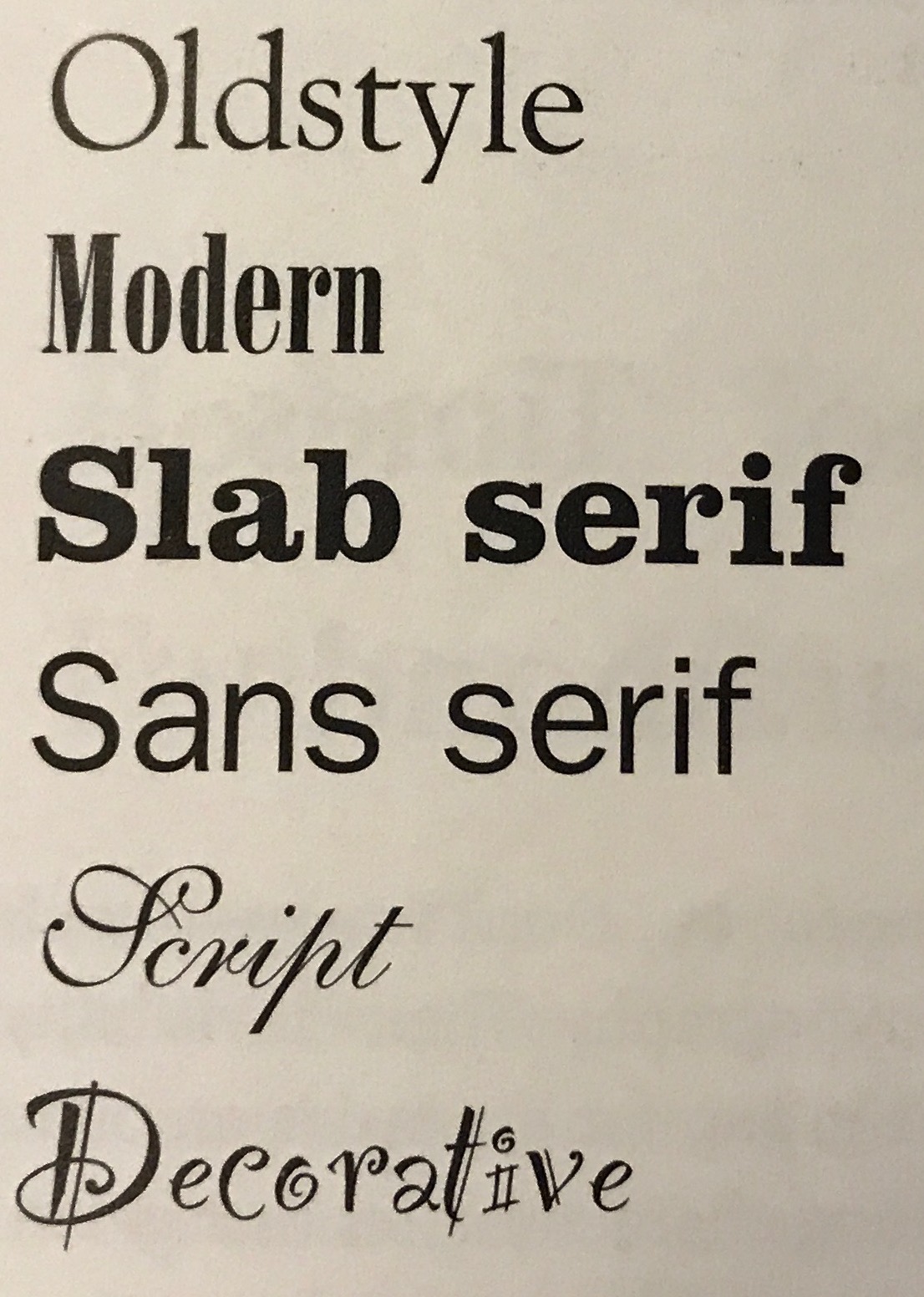
6 groups of typefaces
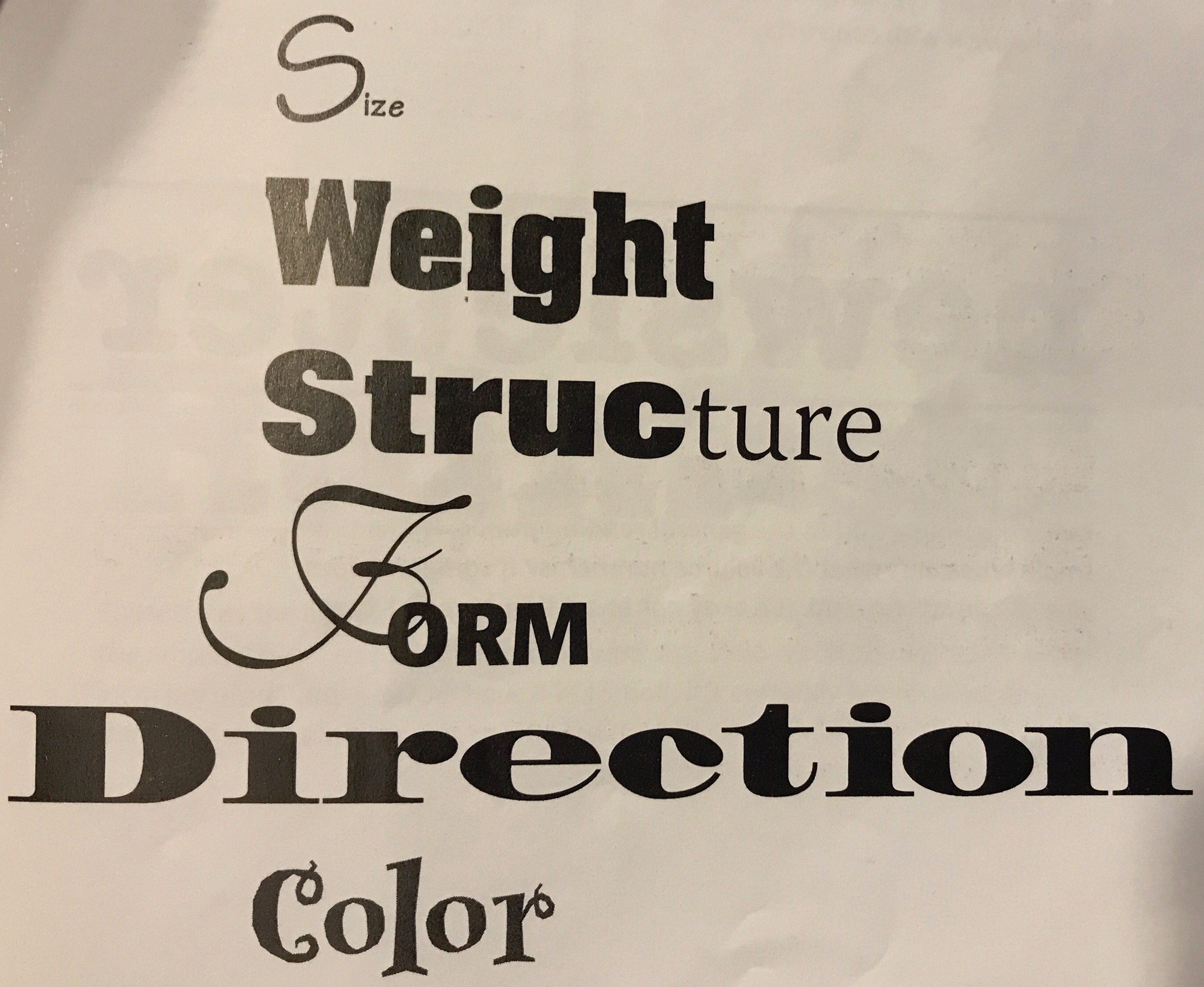
How to make use of the typefaces above?
Here an some examples:
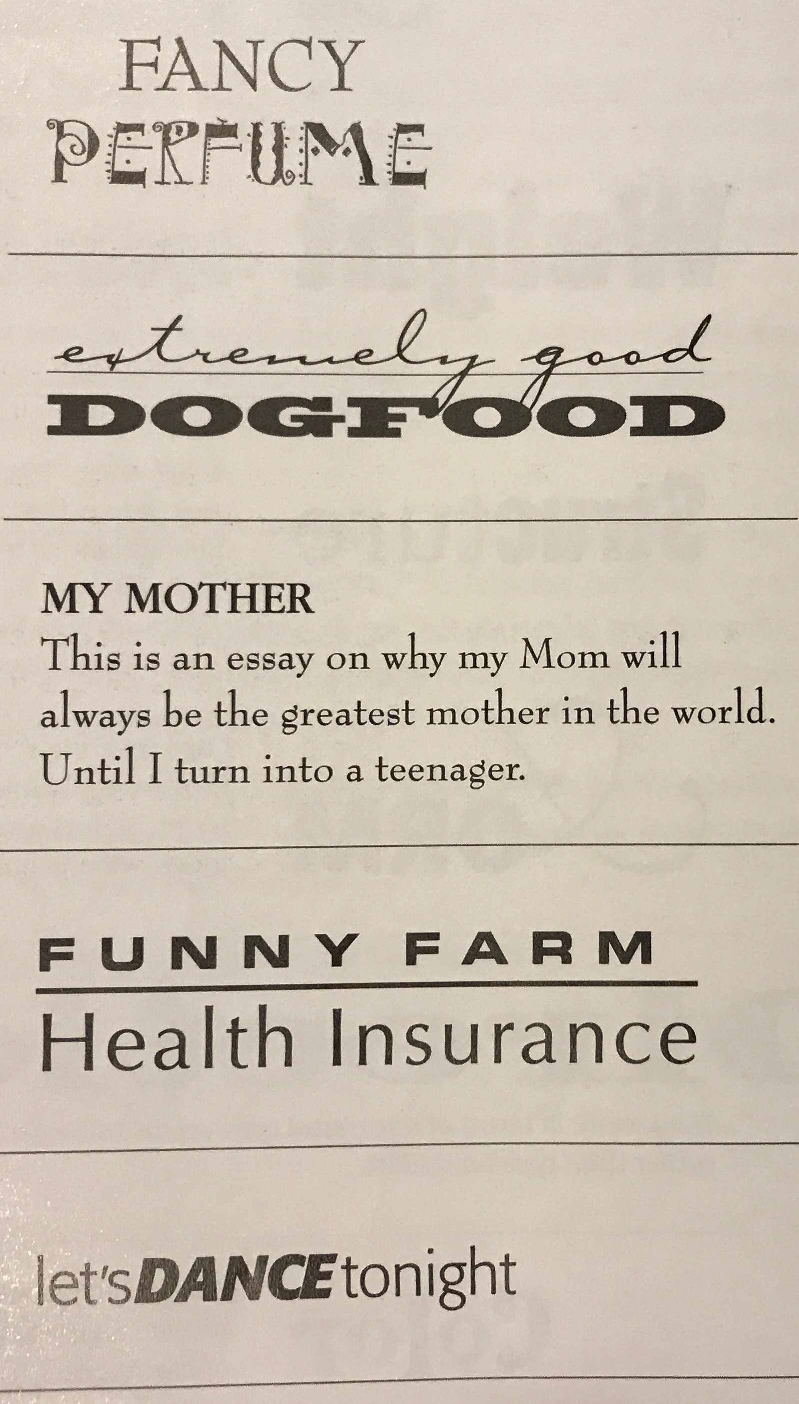
- Fancy Perfume: too many similarities
- Dogfood: good contrast
- My Mother: too many similarities
- Funny Farm: contrast needs to be strenthen
- Let’s Dance: good contrast
A tip over Color:
Our eyes are very attracted to warm colors(reds, oranges), so it takes very little red to attract attention. While cool colors(greens, blues) recede from our eyes, you need more of a cool color to create an effective contrast.
Stinger
After learning all of this, I found my hand-written note page so poor. ![]()